I painted a very expensive table. Three thousand dollars expensive. Well, I didn't pay that much for it. It was $3,000 in the Horchow/Nieman Marcus Catalog. I never loved it. You know why? It was covered in a resin that was painted to simulate wood. It cracked off a lot. It had this ginormous iron thing in the center of the base and pressed metal that made it look cheap...at least to me.
The only reason I bought the table is because it looked a lot like another one I wanted and could not afford. I figured I could paint it.
Then I found the table I really wanted.

It is now in the Dining Room.
Then I had two tables.
I decided to use the first one in our Library...
.jpeg)
There is just so much going on with this table! It would be lovely in the right setting. Just not this setting! The top and sides are pressed metal. Brass, I think. Multi- hued.The carvings are gilded. Then there is the 20 pound decorative thing at the base. It was also very dark. It gave the room a gloomy feeling. I took this photo with my cell phone last year. I apologize for the poor quality.
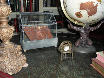
Pressed metal on table surface...
I moved things around in the Library. I removed the salvaged church podium and donated it to a fledgling church. Then we brought in the daybed for under the window...

I am painting the daybed tonight...photos soon! You can see a sneak peek of the painted table...

My newly painted Craigslist "Mora" clock stands opposite the window.

This wall is also a work in progress. I painted the mantel in Annie Sloan Graphite with Duck Egg Blue details. I am at a loss as to what color to paint the mirror. It is far too gold. I think I am going to trade these sconces for a crystal pair. Help me decide! Please?

This is my library inspiration. I cannot find the source. I have had this photo in my internet archives for a long time!

I removed the ginormous, ornate metal piece to make more room for books on the bottom.
I painted the entire table in Annie Sloan Old White but it looked too yellow. I painted one coat of Annie Sloan Pure White, followed by her Clear Wax.
See the Oriental rug waiting to be placed? It has jewel tones...reds, blues, cream...

I then burnished the entire piece with aluminum foil for a subtle grey patina.
I like it a lot better than the original but something is not quite right. I like how the aluminum foil makes the pressed metal look like carved wood. I think it needs to go grey with white drybrushing. I'm not sure.
This is where YOU come in!

The first photo is really blurry. Ironically, that is what the table started to look like to me after a while...just a big, dark blur! LOL!
Help me decide, will you?
I didn't start this blog because I knew what I was doing.
xo
Andie
***Update!***
Thank you, friends, for your gracious advice. I spent some time, last night, coating the table with Annie Sloan Dark Wax. I figured if I didn't like it I could always paint it grey. I also found a wool tapestry that I forgot I had. I think it would look great above the mantel. I have included photos.
This is really beginning to come together!

I think I like this! I will live with it for a week or two, then decide.

A side by side comparison, before and after Dark Wax.
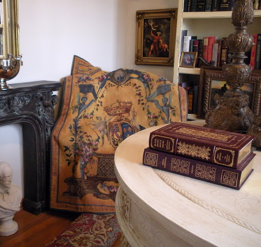
How did I forget that I had this wool tapestry? I purchased it this summer from a lovely woman on Craigslist. I think it is perfect for over the mantel. I don't have a drapery rod that fits, yet.

The Dark Wax went on pretty heavy. It was unintentional but I do like the overall look!

Getting closer to my inspiration...thanks to my Blog friends!
I was browsing through one of my all time favorite decorating books, last night, for inspiration, "The New Eighteenth Century Style" I came across the very same photo shown above. I had
not looked through the pages for a great while. Now I can give credit to Annie Camille, of La Beauce, Normandy!
I think I can put the rug down..that bare floor absolutely glows in the dark!
Now I will paint the daybed...and I think the shelves need to be grey...